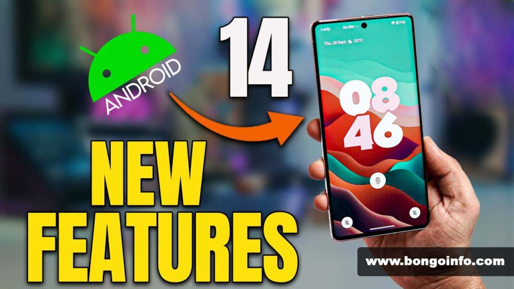
Android 14 review – Android 14 has added new features
Android 14 goes with a codename inspired by a dessert; outside of Google, where new Android versions are always given a codename with a dessert theme, it’s called Android Upside-Down Cake. Since most of the new software’s added functionality is concealed from your view at first glance, this term is much more appropriate for it.
The improvements in Android 14 might not be apparent right away, even if you’re an avid user of Android phones. But worry not—Google has made some changes to your phone that, once you find them, you’ll probably find enjoyable.
Google packed Android 14 with a number of valuable updates that enhance the privacy, customizability, and accessibility of compatible devices. The interface has also been slightly smoothed up, removing some long-standing rough edges. Furthermore, you’re more likely than ever to obtain these capabilities on your existing smartphone thanks to the top Android phones’ improved upgrade schedules, which should prevent you from having to upgrade your hardware for a while.
Since Google prefers to keep its OS and app updates separate, there aren’t actually as many newsworthy additions in Android 14 as there were in iOS 17, the most recent rival update for iPhones.
However, Android is also made to function on hundreds of different smartphone models made by other manufacturers. It’s more difficult to make significant modifications when you aren’t developing software for the devices owned by your own business.

Android 14: Compatibility
After announcing that Android 14 would be available on October 4, 2023, users of the Pixel 4a 5G and later Google-built devices can now get it. Android 14 will likely come pre-installed on any Android phone released in the upcoming year, but the situation is more convoluted for phones that are already out of the Google family.
For example, Samsung states that from November 13 to December 1, compatible phones will receive the One UI 6 upgrade. Starting on November 16, OnePlus phones will receive the Android upgrade version 14.3, or Oxygen OS 14, albeit not concurrently everywhere in the world. While some companies, like Asus and Motorola, are remaining silent, they ought to release their updates by the beginning of next year at the latest.
Android 14: Interface and Design
The more extensive lock screen customization system in Android 14 is among the biggest—and most noticeable—changes. If your phone is unlocked, you can now view it straight from the lock screen. New clock designs and layout templates are available, and all of them come with AI intelligence that adjusts the clock’s visibility based on other information displayed on the screen, such as the weather forecast.
The ability to select alternative Lock Screen shortcuts is another important feature of this. Although I’m happy with the dependable camera/flashlight combo, it’s nice to have the option to switch to a shortcut to your Google Wallet, Do Not Disturb mode, or Google Home controls—features that are currently unavailable on iPhones.
Changing the wallpaper on your phone is a significant part of personalizing it, and Android 14’s AI wallpaper generator comes in handy when you can’t locate the perfect picture to use as your virtual backdrop. A collection of twelve pre-loaded themes is used to operate this, and each theme has a pre-loaded prompt with customizable keywords. Although the feature limits your creative flexibility, you can still customize it to the extent that you can build a compelling prompt and have it appear specifically for you.
Even with Android 14, you can still use dynamic theming on your phone, which selects UI element colors based on your wallpaper. However, if you’d rather keep things straightforward, you may now choose a Monochrome theme. While this won’t affect every area of the phone—particularly when you access non-Google apps—you can create a more serene, neutral space on your home screen by activating this, activating the “Themed icons” beta option, choosing a suitable grayscale background, and possibly hiding your disobedient app icons in folders.
The revised At a Glance widget, which provides non-Pixel users with a more contemporary-looking widget that yet conveys crucial information like the weather and future appointments, is the final UI upgrade to be discussed. If Google apps are deeply ingrained in your life, the Pixel version of At a Glance remains a great addition to any Android phone’s home screen. It also comes with a lock screen version for added convenience.
Android 14: Audio and Camera
With Android 14, you may enjoy a pleasant improvement in photography with Ultra HDR photographs. This feature, available on the majority of new flagship phones, makes it possible to capture and examine photos with more realistic colors. On an SDR screen, these photographs will still look great; they just won’t have the added detail that an HDR display would provide.
But as of right now, the problem is that this function is limited to the Pixel 8 and Pixel 8 Pro, and it appears to be turned on by default with no way to turn it off. If and when Google incorporates a toggle into its camera app that displays the visual differences between Ultra HDR and non-Ultra HDR photographs, we’ll take another look at this. However, given that the Pixel 8 series’ picture file sizes appear to be no bigger than those of a normal photo, perhaps this technique will end up being beneficial overall.
Although it’s not currently live as a feature and doesn’t have a release timetable, audiophiles will be pleased to learn that Android 14 offers lossless USB audio. If you have a set of wired headphones or earbuds, you can stream or play locally stored, properly formatted tunes in greater quality if you plug them into your device (probably via a headphone port to USB-C adaptor). On the surface, this seems like a fantastic addition, but there is still another function that we need to properly test and review.
Interface of Android 14
Because Google hasn’t made any changes, Android 14 by default still appears a lot like Android 13 while navigating through your home screens, apps, and menus. The good news is that a number of fundamental Android features have been expanded in sensible and beneficial ways.
The predictive back animation in Android 14 is a wonderful addition that allows you to preview the page you intend to return to before committing to the action. I find myself using it virtually every day. Sadly, it’s still not fully deployed on Android 14, since it doesn’t function in some apps that you would think it would, but other than Google introducing a more readily available toggle outside of Developer Settings, it feels nearly complete.
The developer-focused feature that allows you to add unique options to the share sheet is one that I would specifically recommend for a “One to Watch” award in the Android 14 update. Although the impact of this feature on Android will depend on developers’ decisions and how they utilize it, some apps—like Chrome—have already made good use of it.
When you try to share a URL in Chrome, the share sheet is modified and now includes your regular list of frequently used contacts and apps, in addition to shortcuts to take a full-page screenshot, create a QR code link, or transfer the page to one of your connected devices. It seems like a perfect match and gives the share sheet greater versatility as a one-stop shop for users who want to transfer files and data between apps and outside of their phone. I sincerely hope that more apps will utilize this in the future.
Copy-paste is another common smartphone function, and Android 14 has made it better by allowing you to drag and drop text or images between apps. Before Android 14, you could only move items around inside the same app window, which meant that you would still need to use the recognizable pop-up buttons for the majority of copy-and-paste tasks. Owners of foldable phones, who are more likely to have multiple apps open in multi-window mode and require more from their phone’s virtual clipboard, should find it especially helpful to enable drag-and-drop copy-paste.
A minor yet useful system modification is the Regional Preferences menu. This allows you to choose the first day of the week, number systems, and temperature units all from one menu. It is much easier than needing to adjust each one separately in every app.
Google’s enhanced Battery Saver mode now allows users to select between severe and standard mode when using the toggle for more efficiency. Additionally, a new power consumption view shows you how much less battery life you’ve had since your previous charge, how long you’ve spent using the screen, and which apps and systems you’ve been using. Google’s return to a more widely used approach to analyzing your phone’s usage and power efficiency is the simple battery and screentime tracking feature, which was tested alongside an alternate 24-hour battery life view in Android 12 and Android 13. It’s healthy to own up to your mistakes.
Android 14: Privacy and Data
Over the past few years, Android has improved its handling of user data, and Android 14 is no exception. A lot of this occurs in the background or shows up briefly before disappearing once you’ve made a choice, but it exists nonetheless, presumably giving you more peace of mind.
More thorough permission request pop-ups should now be common when configuring apps for the first time. While I was testing, I was unable to see any of them, but the samples in Google’s release papers indicate the company has produced some clear, concise English explanations of what would happen to your information if you gave an app access to, instance, your location data.
Similarly, instead of having almost identical data sets spread across all of your apps—possibly with various security policies—the new Health Connect service operates to centrally store and safeguard your health and fitness information. Health Connect provides both increased convenience and security by encrypting your data, keeping it local, and sharing it with fitness applications as needed.
Google hopes to get its users to upgrade to a 6-digit PIN on Android 14 instead of the default 4-digit one, thus enhancing their security and encouraging them to be more aware of their privacy. Android 14 rewards users who use longer passcodes by enabling PINs with six or more digits to unlock phones without the need to press the enter key.
For the security of your device’s data, changing your PIN to six digits seems sensible, as the majority of us rely on biometric recognition in one way or another. To further hinder a shoulder-surfing hacker from deciphering your code, you can disable PIN animations.
Android 14: Accessibility
Google has an obligation to make sure that as many people as possible have a simple time using Android-powered phones, as it is essentially one of the two players in town. Although it’s difficult for me to assess the usefulness of Android 14’s accessibility features from the outside without a disability, it’s only fair to take a moment to review what the operating system has to offer in this area. Furthermore, these features might come in handy for anyone in the appropriate situation.
Google’s improved hearing aid support, which includes a new dedicated set-up system, the ability to select which sounds appear through the hearing aids and which are played via the phone speaker, and a Quick Settings shortcut to quickly return to these settings when needed, should relieve Android phone users who depend on Bluetooth-enabled hearing aids to communicate with their phones. It’s best to verify with your manufacturer before attempting to utilize any of these features if you wear hearing aids, as some of them may be dependent on the makers to implement.
Flash notifications are a helpful feature that not only helps people with hearing loss but may also benefit those with normal hearing. It allows you to see when messages are arriving without having to hear the notification tone or feel the phone vibrate. You can use this setting to use the camera flash on the back of your phone, a colored overlay on the display, or both at once. I occasionally utilized rear flash notifications on my iPhone, so I would have been pleased to see Android just catch up in this regard. However, Android 14’s clever evolution of this earlier setting is the addition of the display flash mode, which ensures that you never miss your notification flash even when your phone is facedown.
Google updated its on-screen magnification feature to better serve users with vision problems. Tapping and pinching the screen will allow you to easily resize or alter the zoom level. If you’d like, you can also utilize a setting that keeps the magnifier on when switching between apps, saving you the trouble of constantly turning it on and off. When necessary, though, it’s easy to turn the magnification on and off manually thanks to the volume button shortcut.
Android 14’s enhanced text scaling algorithm, which grows larger text more gradually to prevent abruptly spoiling the page layout and gives a new maximum size of 200%, up from 130%, is what you should look at if you require your text to be permanently increased. If a certain app or website proves to be difficult to read, you can also add a shortcut to change the font size in the quick settings.
One UI 6 on Android 14
Although Android is available in several forms, this evaluation is mostly focused on the vanilla/pixel version of Android 14. As I’ve been testing One UI 6 as well, one of the largest is Samsung’s One UI. Let’s take a moment to examine what Samsung users will receive in addition to Google’s universal improvements.
Samsung has improved upon the Android 14 default lock screen modification by enabling you to easily move and resize the clock to any location inside the top third of the lock screen. With just two size presets and no movement options other than choosing one of the vertically aligned clocks, Galaxy phone users have significantly more customization options when it comes to their lock screen than Google’s default.
Samsung has also attempted to remodel the quick settings panel, which is located above your alerts and contains important options. In addition to the six standard options for managing the flashlight and basic connectivity settings, you also receive a brightness slider for the first time. The primary distinction may be discovered by sliding down a second time to reveal a full-screen control panel with a grid of 12 options and separate areas for Bluetooth, Wi-Fi, and brightness. It’s a far more intelligent use of available space, keeping key features close at hand while also allowing the entire range of alternatives to have some breathing room when needed.
In contrast to stock Android 14, Samsung’s One UI 6 significantly redesigned the camera app. A dedicated resolution button allows you to rapidly switch between the 12MP, 50MP, and 200MP primary camera modes—assuming your phone’s sensor supports them—in a redesigned layout.
Samsung’s new camera widget, which you can tune to open the front or back cameras in a certain mode and send the images you snap to a selected album, allows you to access the camera more quickly from your home screen.
Previously, you had the option to save settings from a prior use or have the camera app reset to default settings each time you opened it. These shortcuts are a creative approach to expanding upon the well-trod lock screen or button-press camera shortcut that other phones employ, and they make it much faster to open the exact settings you need at that moment.
Once you have some photos on hand, you can try out One UI 6’s new image editing features, which include buttons for undoing and redoing changes to easily see how small adjustments affect different areas of a shot and shortcuts to frequently used actions from an image’s information page.
I believe I have a bit of a set taste when it comes to phone photography, and maybe you do too, but these improvements might actually motivate me to do more post-production on the images I shoot with Samsung phones. With some of the most powerful chips available for Android handsets, Samsungs—especially the top Galaxy S and Galaxy Z models—make superb photographers, so what better way to make the most of them than by cropping, editing, and improving your photos?
Android 14: Conclusion
It’s challenging to render a definitive assessment of a new Android version because Android 14 lacks some features and will gain more in future 14.x releases as well as updates from specific manufacturers. In fact, Google began testing its second quarterly platform upgrade for Android 14—which includes more improvements like single-app screen recording—while I was writing this.
As of right now, however, with Android 14, every new feature enhances significant aspects of the Android experience, albeit in subtle ways that are meant to blend in. Even though Google has made some very smart tweaks, there hasn’t been a significant enough update to completely change the way you use your phone. The excitement around AI wallpaper creation won’t be as great as it was for iPhone owners when StandBy Mode debuted on iOS 17.
The interesting software enhancements that Google has unveiled this year are all Pixel exclusive, which is irksome. Android 14 would have been a fantastic release if it had included features like Magic Editor, Magic Eraser, or even just call screening. But in a negative way, the basic version leaves us wanting more.
You would be foolish to simply refuse to accept the update, though, as Android 14 does offer a lot of useful features. However, if you were hoping that this version of Android would revitalize your phone, you’ll have to wait until Android 15 rolls around next year and hope that it has more to offer, or hope that your phone manufacturer will add more fun additions to Google’s framework.


